Back to Work
UX DESIGN / PROTOTYPING
IRS Make a Payment Redesign
Transforming a rigid checkout feature serving over 13M users into a flexible, multi-payment process.
ROLE
Lead UX Designer
TIMELINE
Feb – July 2024
TEAM
2 Designers ~ 5 Eng
PLATFORM
Web ~ Responsive
UX DESIGN / PROTOTYPING
IRS Make a Payment Redesign
Transforming a rigid checkout feature serving over 13M users into a flexible, multi-payment process.
Back to Work
ROLE
Lead UX Designer
TIMELINE
Feb – July 2024
TEAM
2 Designers ~ 5 Eng
PLATFORM
Web ~ Responsive
UX DESIGN / PROTOTYPING
IRS Make a Payment Redesign
Transforming a rigid checkout feature serving over 13M users into a flexible, multi-payment process.
Back to Work
ROLE
Lead UX Designer
TIMELINE
Feb – July 2024
TEAM
2 Designers ~ 5 Eng
PLATFORM
Web ~ Responsive
Back to Work
UX DESIGN / PROTOTYPING
IRS Make a Payment Redesign
Transforming a rigid checkout feature serving over 13M users into a flexible, multi-payment process.
ROLE
Lead UX Designer
TIMELINE
Feb – July 2024
TEAM
2 Designers ~ 5 Eng
PLATFORM
Web ~ Responsive
OUTCOME
+10%
increase in completion rate.
57%
reduction in critical errors before confirmation.
530k+
users saved from exiting to Direct Pay.
Designer's Note
The IRS already carries a negative connotation, and there’s a lot of misinformation and anxiety over doing anything wrong. Many people don’t know their options, or even the fact that they can make payments directly within their own online account. Because these tools aren’t broadly marketed, large populations would rather hand the burden off to a third party or let their fees accumulate in desperation and freeze.
We found that the IRS is seen as a financial institution, yet the mental model that users apply universally to other platforms wasn’t reflected in this Make a Payment experience. Bringing all the essential features internally within the flow was the minimum threshold to make it intuitive. I initially tried keeping it similar to the original layout of fill-in blocks, just structured more clearly. However, due to the density of the information and the technical limit of 5 payments per session, a better grouping mechanism had to exist. By employing Gestalt principles, we brought in a dynamic card system with a balance summary, allowing users to easily add and remove payment cards as needed.
The IRS designs as inclusively as possible, but at times that can make a feature muddy and non-intuitive for everyone.
Going forward, I realize having a multifaceted user base requires a lot of thought, mapping, and discussion between stakeholders. learned that adaptation is necessary for clean flows. By having different methods of payment that resonate with different life scenarios—a quick flow for those in good standing, a different flow for those on payment plans, and adapted approaches for elderly or ESL users—we can build experiences that actually work for everyone. Holding this holistic view gave me a better picture of how to manage projects with extremely diverse audiences going forward.
Context
On average, 10+ million payments are made using this tool which hasn’t been revamped since 2021.
Data showed that users frequently paid within multiple categories (e.g., Balance + Estimated Tax), logging about 100M annual sessions.
01
Time Consuming Loop
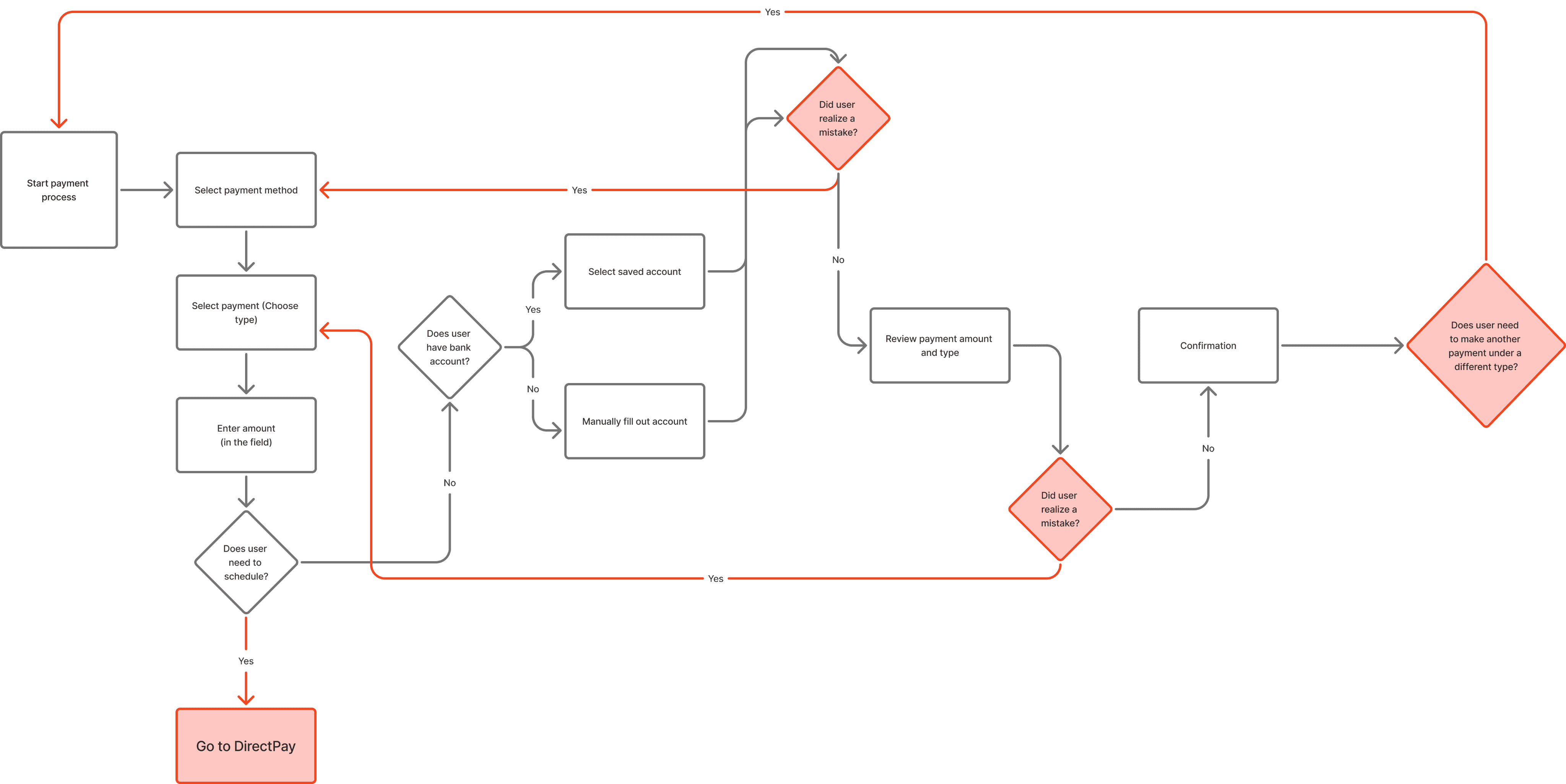
To make two separate kinds of payments, users had to complete one and then restart the entire flow. Doing this 3 times triggered the daily session limit.
02
Limited Error Resolution
Errors are most likely to be discovered on the Review page, which required users to continuously press “Back” to edit the information, then forward to reach Review again.
03
Cognitive Overload
Users had to mentally keep track of the payments they’ve entered, while possibly scrolling through numerous amounts of fields to find the exact one they’re paying for.
Research
phase 01
We leveraged user data from previous studies and conducted competitive analysis on existing cart processes, synthesizing all findings to reveal a disconnect between the current design and user/industry expectations.
01
Users align the Individual Tax Account & IRS with a financial institution model.
02
Users experience increased stress when dealing with the IRS and committing errors in tax payments is flagged as a high-stakes concern.
03
Industry standards prioritize flexibility, control and easy to grasp design, allowing customization with steps & edits at various points of the flow.

IDEATION
phase 02
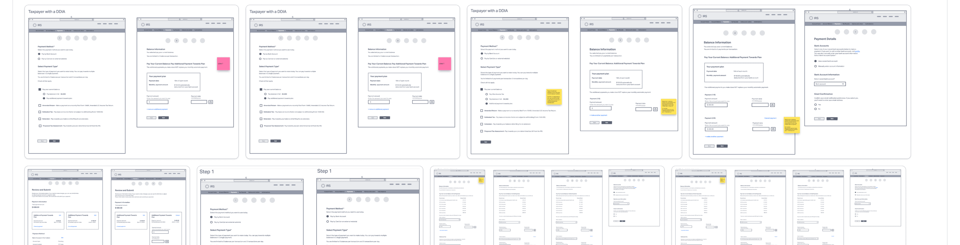
First our team started out with paper sketches to quickly come up with various layouts & ideas. Then, we moved onto low-fidelity wireframes to further visualize and solidify concepts.
How might we implement a checkout experience that is intuitive and flexible for users?
Information architecture
2 maps
Old Flow
Have to click out to another platform to schedule & start over to make more payments.
New Flow
Brought scheduling into the experience & added more flexibility in the flow for additional payments & editing.
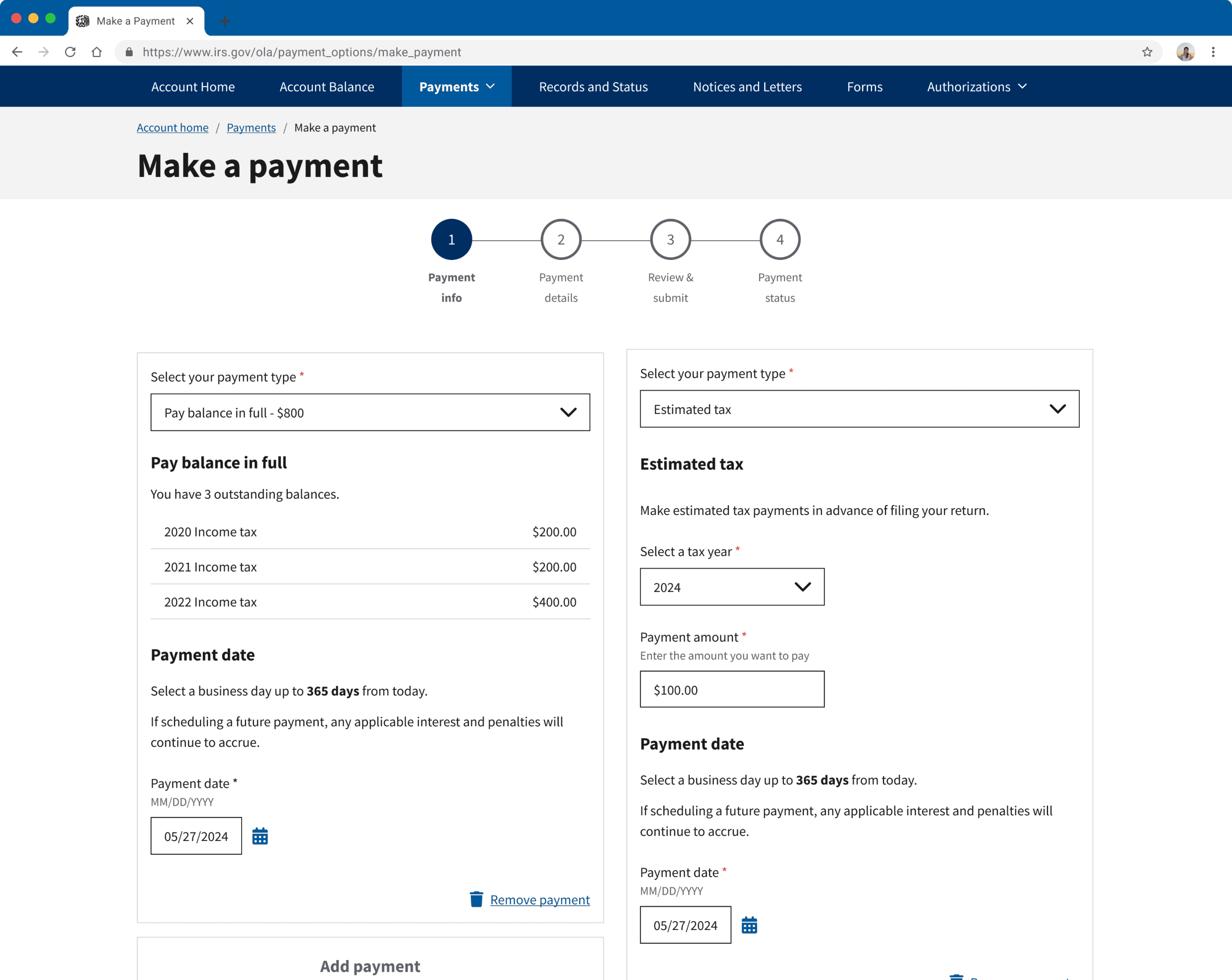
THE SOLUTION
FIX 01
Flexibility
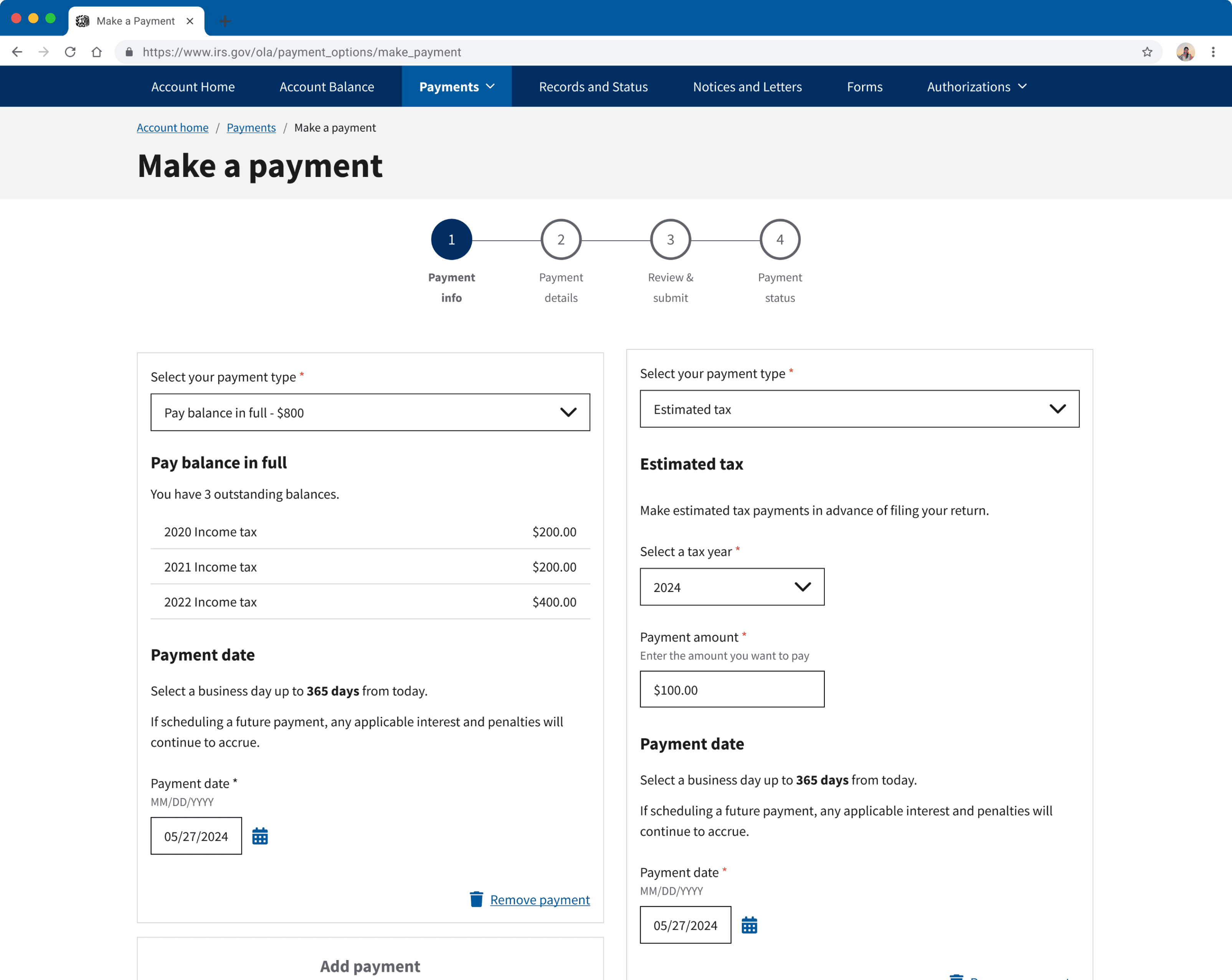
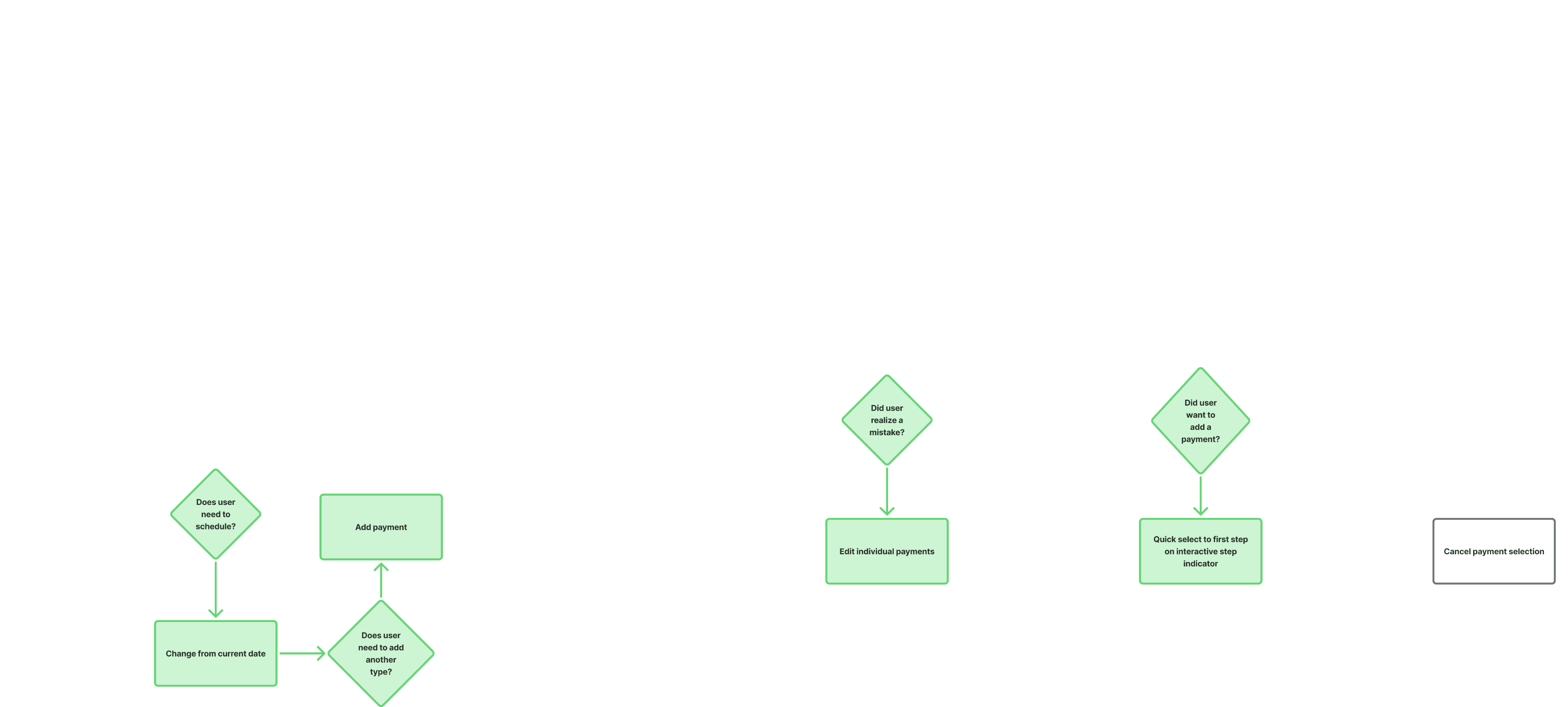
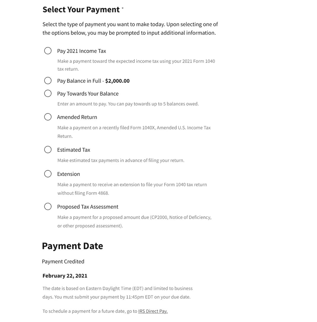
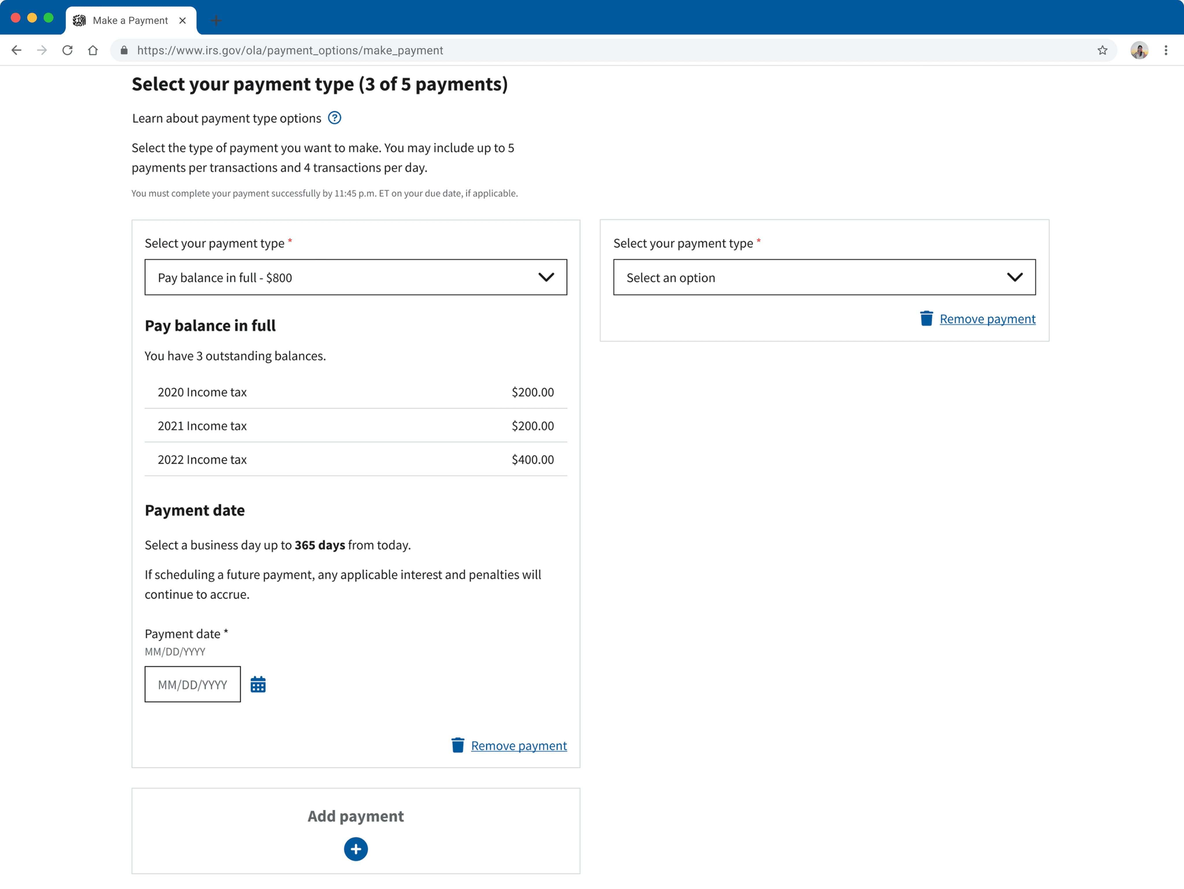
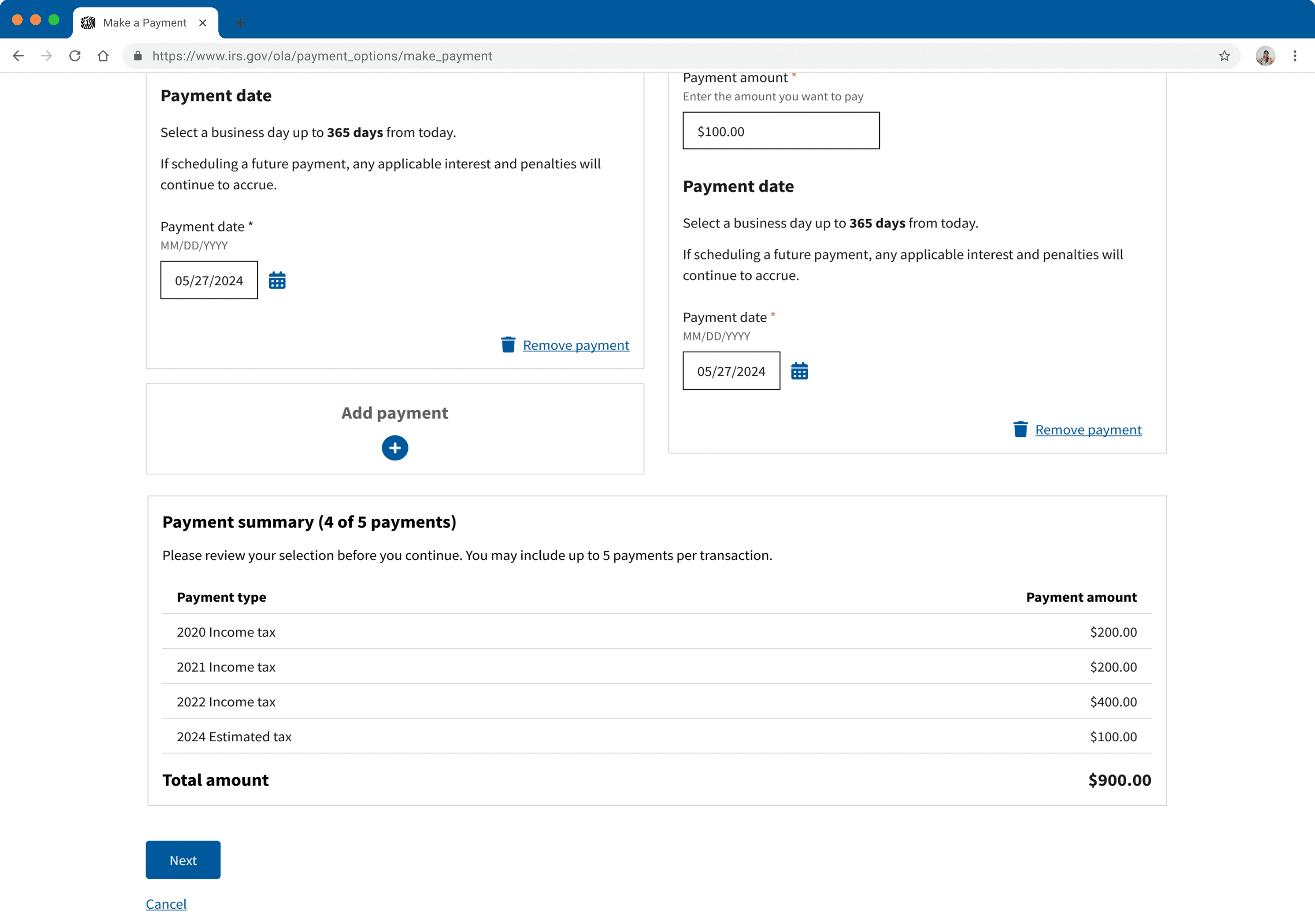
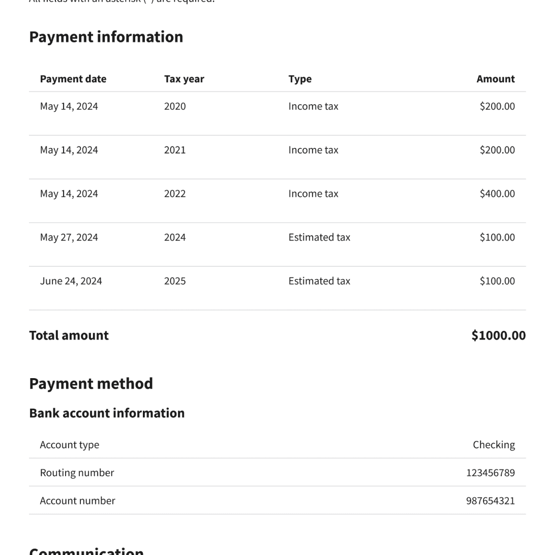
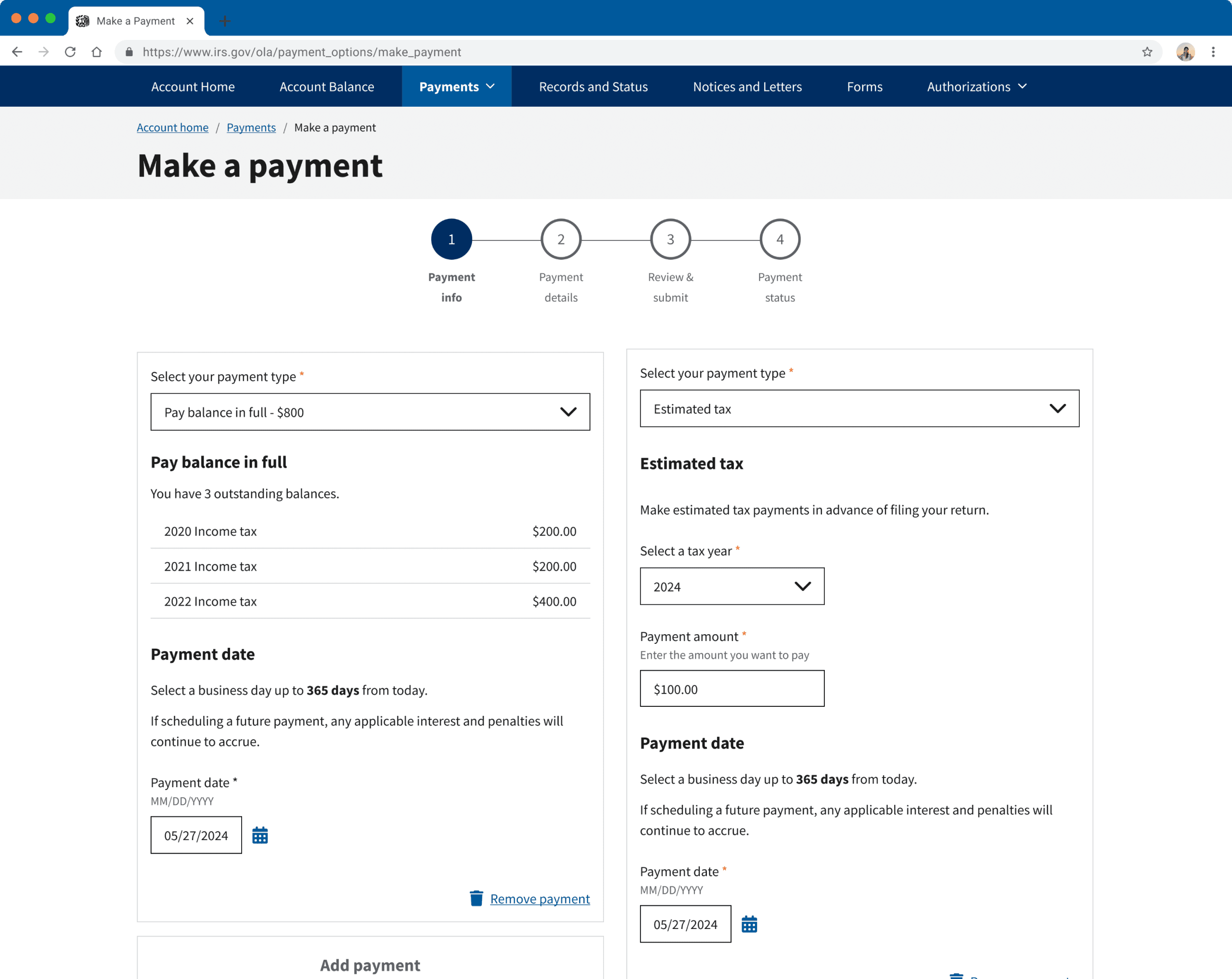
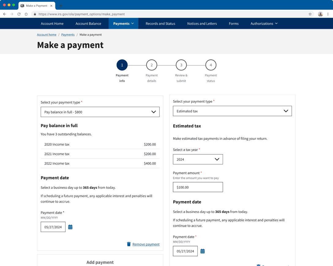
Users can now select multiple payment type options & assign payment dates within a single checkout, giving them more control & saving them time.
Original
Could only select one choice per session. Only at the bottom of the page, did they mention starting over payments at IRS Direct Pay in order to schedule them.
NOW
Users can now add other types of payments as necessary. There is an option to schedule payment dates in each payment card, even expanding to individual payments within a card.

Original
Input fields were listed vertically, making it hard to scan and easy to input a payment in the wrong field. Furthermore, there was no feedback tracking what the user entered.
FIX 02
Grouping & Feedback Visibility
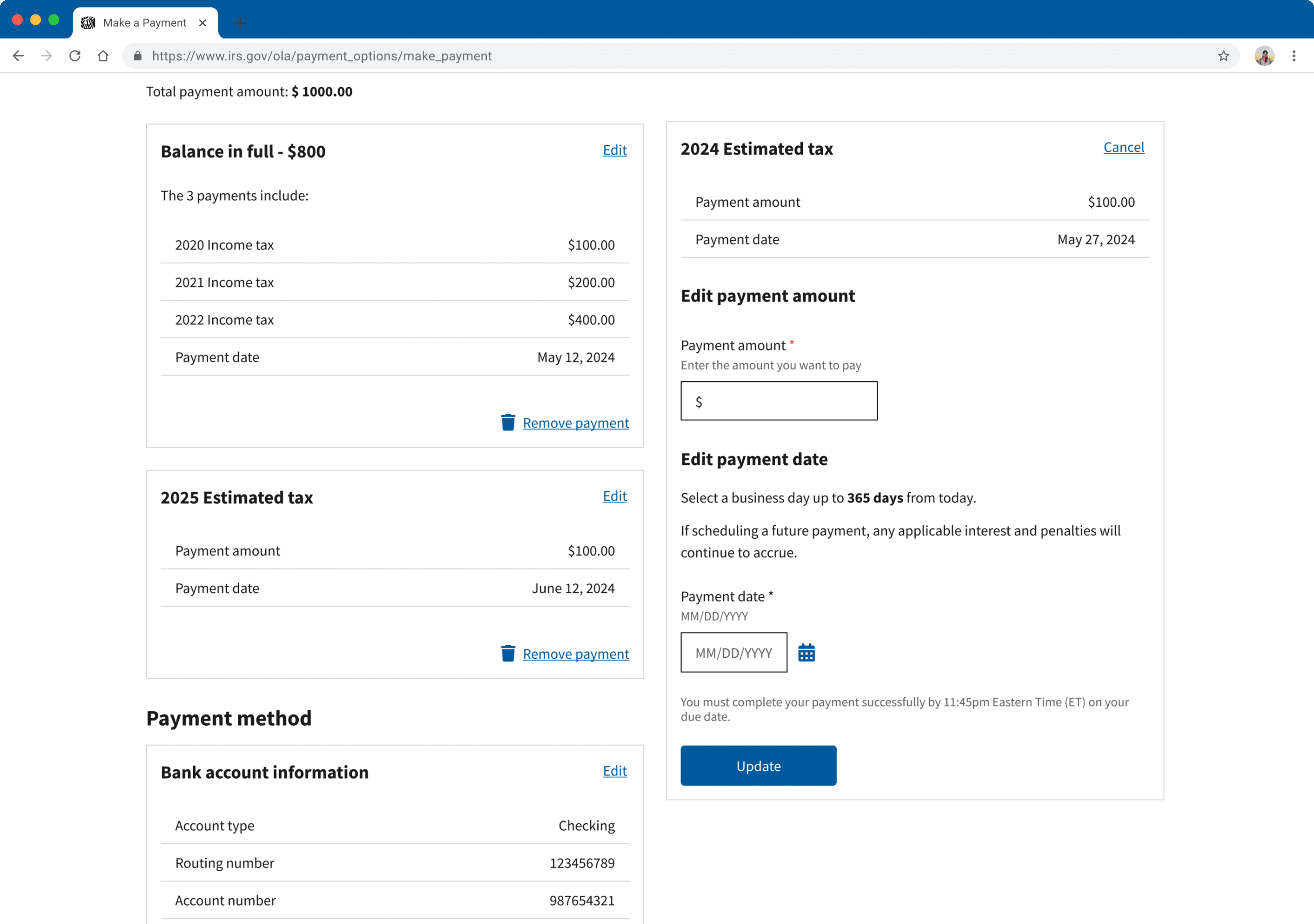
Transformed into a modular card system. The balance table was implemented, providing a clear visual distinction and relinquishing them from tracking responsibility.
NOW
Payments are separated into individual cards, employing gestalt principles to make the interface more intuitive. The balance table also provides visual feedback, reducing user cognitive load as they enter in their payments.
FIX 03
Error Prevention
The original architecture was inflexible for fixing errors. We introduced edit states within the Review step to allow users to fix details then & there, saving them time.
Original
The review page was static, allowing users only to view the information. If making any changes had to go back to a previous step or completely restart.
NOW
Each section is now editable on the review page, allowing users to quickly fix small mistakes or delete payments.

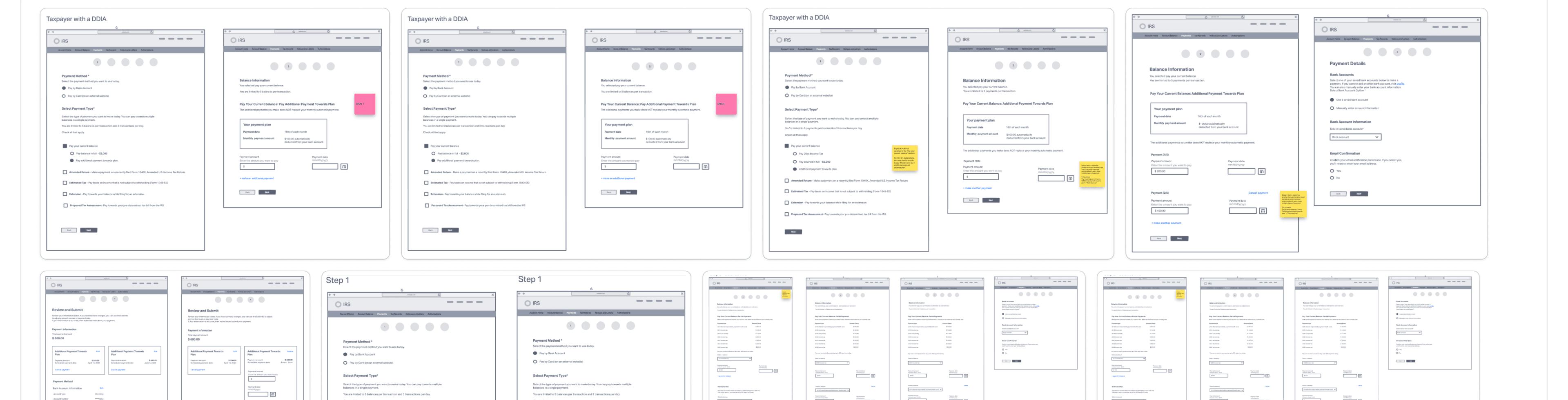
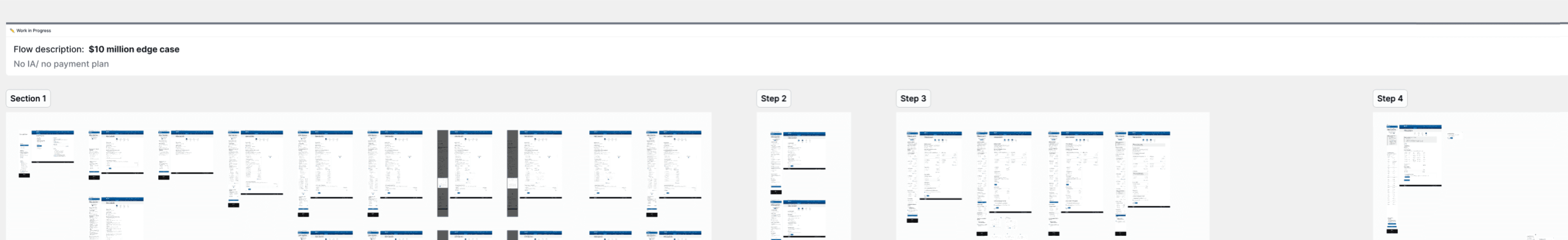
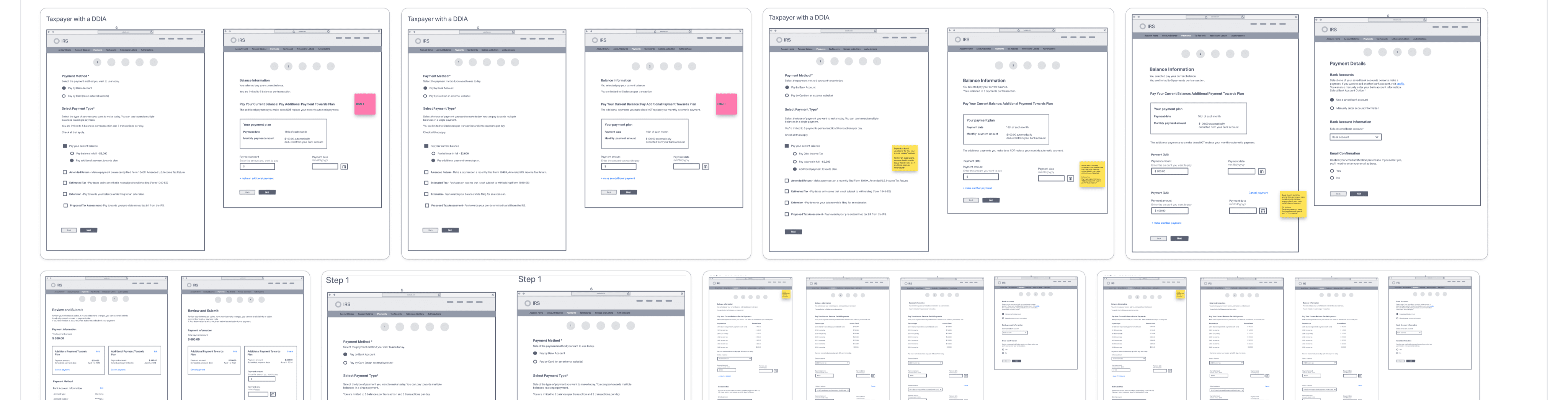
EDGE CASES
7+ scenarios
Beyond this primary flow, the three scenarios - DDIA, RIA, STIA - were also designed, alongside 7+ edge cases spanning error states and rare personas.
WCAG 2.1 AA & 508 validated
IMPACT
10%
increase in full completion rates.
From review to completion, we see a 5% drop-off rate compared to the previous 15%.
57%
reduction in critical errors before confirmation.
Error rates dropped from 3.7% to 1.6% between Review and Confirmation.
530k+
users saved from exiting to Direct Pay.
Eliminated click-outs to another app for payment scheduling from 531,199 users to 0.
KEY LEARNINGS
01
I learned that simplifying design explanations into business terms was the key to focusing stakeholder attention, helping us not to navigate off-course into minor details.
02
Bringing the tech team in during the early phases allowed us to identify the API limits early, helping us implement design features to address constraints.
03
Working in tandem on the broader concept, then separating to work on the separate scenarios and concepts made it easier & more efficient as everyone had the same idea & knowledge to build upon.
NEXT STEPS
01
Conduct A/B testing to benchmark the new "Multi-Select" flow against the old "Linear" flow to measure time-saved per task.
02
Moderate 9+ usability sessions to investigate if users understand the new flow intuitively and identify any pain points for a feature state.
03
Make rapid, immediate changes for any critical issues using testing post-launch.
Designer's Note
The IRS already carries a negative connotation, and there’s a lot of misinformation and anxiety over doing anything wrong. Many people don’t know their options, or even the fact that they can make payments directly within their own online account. Because these tools aren’t broadly marketed, large populations would rather hand the burden off to a third party or let their fees accumulate in desperation and freeze.
We found that the IRS is seen as a financial institution, yet the mental model that users apply universally to other platforms wasn’t reflected in this Make a Payment experience. Bringing all the essential features internally within the flow was the minimum threshold to make it intuitive. I initially tried keeping it similar to the original layout of fill-in blocks, just structured more clearly. However, due to the density of the information and the technical limit of 5 payments per session, a better grouping mechanism had to exist. By employing Gestalt principles, we brought in a dynamic card system with a balance summary, allowing users to easily add and remove payment cards as needed.
The IRS designs as inclusively as possible, but at times that can make a feature muddy and non-intuitive for everyone.
Going forward, I realize having a multifaceted user base requires a lot of thought, mapping, and discussion between stakeholders. learned that adaptation is necessary for clean flows. By having different methods of payment that resonate with different life scenarios—a quick flow for those in good standing, a different flow for those on payment plans, and adapted approaches for elderly or ESL users—we can build experiences that actually work for everyone. Holding this holistic view gave me a better picture of how to manage projects with extremely diverse audiences going forward.
Context
On average, 10+ million payments are made using this tool which hasn’t been revamped since 2021.
Data showed that users frequently paid within multiple categories (e.g., Balance + Estimated Tax), logging about 100M annual sessions.
01
Time Consuming Loop
To make two separate kinds of payments, users had to complete one and then restart the entire flow. Doing this 3 times triggered the daily session limit.
02
Limited Error Resolution
Errors are most likely to be discovered on the Review page, which required users to continuously press “Back” to edit the information, then forward to reach Review again.
03
Cognitive Overload
Users had to mentally keep track of the payments they’ve entered, while possibly scrolling through numerous amounts of fields to find the exact one they’re paying for.
Research
phase 01
We leveraged user data from previous studies and conducted competitive analysis on existing cart processes, synthesizing all findings to reveal a disconnect between the current design and user/industry expectations.
01
Users align the Individual Tax Account & IRS with a financial institution model.
02
Users experience increased stress when dealing with the IRS and committing errors in tax payments is flagged as a high-stakes concern.
03
Industry standards prioritize flexibility, control and easy to grasp design, allowing customization with steps & edits at various points of the flow.
IDEATION
phase 02
First our team started out with paper sketches to quickly come up with various layouts & ideas. Then, we moved onto low-fidelity wireframes to further visualize and solidify concepts.
How might we implement a checkout experience that is intuitive and flexible for users?
Information architecture
2 maps
Old Flow
Have to click out to another platform to schedule & start over to make more payments.
New Flow
Brought scheduling into the experience & added more flexibility in the flow for additional payments & editing.
THE SOLUTION
FIX 01
Flexibility
Users can now select multiple payment type options & assign payment dates within a single checkout, giving them more control & saving them time.
Original
Could only select one choice per session. Only at the bottom of the page, did they mention starting over payments at IRS Direct Pay in order to schedule them.
NOW
Users can now add other types of payments as necessary. There is an option to schedule payment dates in each payment card, even expanding to individual payments within a card.
Original
Input fields were listed vertically, making it hard to scan and easy to input a payment in the wrong field. Furthermore, there was no feedback tracking what the user entered.
FIX 02
Grouping & Feedback Visibility
Transformed into a modular card system. The balance table was implemented, providing a clear visual distinction and relinquishing them from tracking responsibility.
NOW
Payments are separated into individual cards, employing gestalt principles to make the interface more intuitive. The balance table also provides visual feedback, reducing user cognitive load as they enter in their payments.
FIX 03
Error Prevention
The original architecture was inflexible for fixing errors. We introduced edit states within the Review step to allow users to fix details then & there, saving them time.
Original
The review page was static, allowing users only to view the information. If making any changes had to go back to a previous step or completely restart.
NOW
Each section is now editable on the review page, allowing users to quickly fix small mistakes or delete payments.
EDGE CASES
7+ scenarios
Beyond this primary flow, the three scenarios - DDIA, RIA, STIA - were also designed, alongside 7+ edge cases spanning error states and rare personas.
WCAG 2.1 AA & 508 validated
+10%
increase in completion rate.
57%
reduction in critical errors.
530k+
users saved from exiting to Direct Pay.
OUTCOME
UX DESIGN / PROTOTYPING
IRS Make a Payment Redesign
Transforming a rigid checkout feature serving over 13M users into a flexible, multi-payment process.
ROLE
Lead UX Designer
TIMELINE
Feb – July 2024
TEAM
2 Designers ~ 5 Eng
PLATFORM
Web ~ Responsive

Designer's Note
The IRS already carries a negative connotation, and there’s a lot of misinformation and anxiety over doing anything wrong. Many people don’t know their options, or even the fact that they can make payments directly within their own online account. Because these tools aren’t broadly marketed, large populations would rather hand the burden off to a third party or let their fees accumulate in desperation and freeze.
We found that the IRS is seen as a financial institution, yet the mental model that users apply universally to other platforms wasn’t reflected in this Make a Payment experience. Bringing all the essential features internally within the flow was the minimum threshold to make it intuitive. I initially tried keeping it similar to the original layout of fill-in blocks, just structured more clearly. However, due to the density of the information and the technical limit of 5 payments per session, a better grouping mechanism had to exist. By employing Gestalt principles, we brought in a dynamic card system with a balance summary, allowing users to easily add and remove payment cards as needed.
The IRS designs as inclusively as possible, but at times that can make a feature muddy and non-intuitive for everyone.
Going forward, I realize having a multifaceted user base requires a lot of thought, mapping, and discussion between stakeholders. learned that adaptation is necessary for clean flows. By having different methods of payment that resonate with different life scenarios—a quick flow for those in good standing, a different flow for those on payment plans, and adapted approaches for elderly or ESL users—we can build experiences that actually work for everyone. Holding this holistic view gave me a better picture of how to manage projects with extremely diverse audiences going forward.
Context
On average, 10+ million payments are made using this tool which hasn’t been revamped since 2021.
Data showed that users frequently paid within multiple categories (e.g., Balance + Estimated Tax), logging about 100M annual sessions.
01
Time Consuming Loop
To make two separate kinds of payments, users had to complete one and then restart the entire flow. Doing this 3 times triggered the daily session limit.
02
Limited Error Resolution
Errors are most likely to be discovered on the Review page, which required users to continuously press “Back” to edit the information, then forward to reach Review again.
03
Cognitive Overload
Users had to mentally keep track of the payments they’ve entered, while possibly scrolling through numerous amounts of fields to find the exact one they’re paying for.
IDEATION
phase 02
First our team started out with paper sketches to quickly come up with various layouts & ideas. Then, we moved onto low-fidelity wireframes to further visualize and solidify concepts.
How might we implement a checkout experience that is intuitive and flexible for users?
Information architecture
2 maps
Old Flow
Have to click out to another platform to schedule & start over to make more payments.
New Flow
Brought scheduling into the experience & added more flexibility in the flow for additional payments & editing.
THE SOLUTION
FIX 01
Flexibility
Users can now select multiple payment type options & assign payment dates within a single checkout, giving them more control & saving them time.
Original
Could only select one choice per session. Only at the bottom of the page, did they mention starting over payments at IRS Direct Pay in order to schedule them.
NOW
Users can now add other types of payments as necessary. There is an option to schedule payment dates in each payment card, even expanding to individual payments within a card.
Original
Input fields were listed vertically, making it hard to scan and easy to input a payment in the wrong field. Furthermore, there was no feedback tracking what the user entered.
FIX 02
Grouping & Feedback Visibility
Transformed into a modular card system. The balance table was implemented, providing a clear visual distinction and relinquishing them from tracking responsibility.
NOW
Payments are separated into individual cards, employing gestalt principles to make the interface more intuitive. The balance table also provides visual feedback, reducing user cognitive load as they enter in their payments.
FIX 03
Error Prevention
The original architecture was inflexible for fixing errors. We introduced edit states within the Review step to allow users to fix details then & there, saving them time.
Original
The review page was static, allowing users only to view the information. If making any changes had to go back to a previous step or completely restart.
NOW
Each section is now editable on the review page, allowing users to quickly fix small mistakes or delete payments.
EDGE CASES
7+ scenarios
Beyond this primary flow, the three scenarios - DDIA, RIA, STIA - were also designed, alongside 7+ edge cases spanning error states and rare personas.
WCAG 2.1 AA & 508 validated
IMPACT
10%
increase in full completion rates.
57%
reduction in critical errors before confirmation.
530k+
users saved from exiting to Direct Pay.
OUTCOME
10%
increase in full completion rates.
From review to completion, we see a 5% drop-off rate compared to the previous 15%.
57%
reduction in critical errors before confirmation.
Error rates dropped from 3.7% to 1.6% between Review and Confirmation.
530k+
users saved from exiting to Direct Pay.
Eliminated click-outs to another app for payment scheduling from 531,199 users to 0.
KEY LEARNINGS
01
I learned that simplifying design explanations into business terms was the key to focusing stakeholder attention, helping us not to navigate off-course into minor details.
02
Bringing the tech team in during the early phases allowed us to identify the API limits early, helping us implement design features to address constraints.
03
Working in tandem on the broader concept, then separating to work on the separate scenarios and concepts made it easier & more efficient as everyone had the same idea & knowledge to build upon.
NEXT STEPS
01
Conduct A/B testing to benchmark the new "Multi-Select" flow against the old "Linear" flow to measure time-saved per task.
02
Moderate 9+ usability sessions to investigate if users understand the new flow intuitively and identify any pain points for a feature state.
03
Make rapid, immediate changes for any critical issues using testing post-launch.
Research
phase 01
We leveraged user data from previous studies and conducted competitive analysis on existing cart processes, synthesizing all findings to reveal a disconnect between the current design and user/industry expectations.
01
Users align the Individual Tax Account & IRS with a financial institution model.
02
Users experience increased stress when dealing with the IRS and committing errors in tax payments is flagged as a high-stakes concern.
03
Industry standards prioritize flexibility, control and easy to grasp design, allowing customization with steps & edits at various points of the flow.

Designer's Note
The IRS already carries a negative connotation, and there’s a lot of misinformation and anxiety over doing anything wrong. Many people don’t know their options, or even the fact that they can make payments directly within their own online account. Because these tools aren’t broadly marketed, large populations would rather hand the burden off to a third party or let their fees accumulate in desperation and freeze.
We found that the IRS is seen as a financial institution, yet the mental model that users apply universally to other platforms wasn’t reflected in this Make a Payment experience. Bringing all the essential features internally within the flow was the minimum threshold to make it intuitive. I initially tried keeping it similar to the original layout of fill-in blocks, just structured more clearly. However, due to the density of the information and the technical limit of 5 payments per session, a better grouping mechanism had to exist. By employing Gestalt principles, we brought in a dynamic card system with a balance summary, allowing users to easily add and remove payment cards as needed.
The IRS designs as inclusively as possible, but at times that can make a feature muddy and non-intuitive for everyone.
Going forward, I realize having a multifaceted user base requires a lot of thought, mapping, and discussion between stakeholders. learned that adaptation is necessary for clean flows. By having different methods of payment that resonate with different life scenarios—a quick flow for those in good standing, a different flow for those on payment plans, and adapted approaches for elderly or ESL users—we can build experiences that actually work for everyone. Holding this holistic view gave me a better picture of how to manage projects with extremely diverse audiences going forward.
OUTCOME
Context
On average, 10+ million payments are made using this tool which hasn’t been revamped since 2021.
Data showed that users frequently paid within multiple categories (e.g., Balance + Estimated Tax), logging about 100M annual sessions.
01
Time Consuming Loop
To make two separate kinds of payments, users had to complete one and then restart the entire flow. Doing this 3 times triggered the daily session limit.
02
Limited Error Resolution
Errors are most likely to be discovered on the Review page, which required users to continuously press “Back” to edit the information, then forward to reach Review again.
03
Cognitive Overload
Users had to mentally keep track of the payments they’ve entered, while possibly scrolling through numerous amounts of fields to find the exact one they’re paying for.
10%
increase in full completion rates.
57%
reduction in critical errors before confirmation.
530k+
users saved from exiting to Direct Pay.
Research
phase 01
We leveraged user data from previous studies and conducted competitive analysis on existing cart processes, synthesizing all findings to reveal a disconnect between the current design and user/industry expectations.
01
Users align the Individual Tax Account & IRS with a financial institution model.
02
Users experience increased stress when dealing with the IRS and committing errors in tax payments is flagged as a high-stakes concern.
03
Industry standards prioritize flexibility, control and easy to grasp design, allowing customization with steps & edits at various points of the flow.
IDEATION
phase 02
First our team started out with paper sketches to quickly come up with various layouts & ideas. Then, we moved onto low-fidelity wireframes to further visualize and solidify concepts.
How might we implement a checkout experience that is intuitive and flexible for users?
Information architecture
2 maps
Old Flow
Have to click out to another platform to schedule & start over to make more payments.
New Flow
Brought scheduling into the experience & added more flexibility in the flow for additional payments & editing.
THE SOLUTION
FIX 01
Flexibility
Users can now select multiple payment type options & assign payment dates within a single checkout, giving them more control & saving them time.
Original
Could only select one choice per session. Only at the bottom of the page, did they mention starting over payments at IRS Direct Pay in order to schedule them.
NOW
Users can now add other types of payments as necessary. There is an option to schedule payment dates in each payment card, even expanding to individual payments within a card.
FIX 03
Error Prevention
The original architecture was inflexible for fixing errors. We introduced edit states within the Review step to allow users to fix details then & there, saving them time.
Original
The review page was static, allowing users only to view the information. If making any changes had to go back to a previous step or completely restart.
NOW
Each section is now editable on the review page, allowing users to quickly fix small mistakes or delete payments.
Original
Input fields were listed vertically, making it hard to scan and easy to input a payment in the wrong field. Furthermore, there was no feedback tracking what the user entered.
FIX 02
Grouping & Feedback Visibility
Transformed into a modular card system. The balance table was implemented, providing a clear visual distinction and relinquishing them from tracking responsibility.
NOW
Payments are separated into individual cards, employing gestalt principles to make the interface more intuitive. The balance table also provides visual feedback, reducing user cognitive load as they enter in their payments.

EDGE CASES
7+ scenarios
Beyond this primary flow, the three scenarios - DDIA, RIA, STIA - were also designed, alongside 7+ edge cases spanning error states and rare personas.
WCAG 2.1 AA & 508 validated
IMPACT
KEY LEARNINGS
01
I learned that simplifying design explanations into business terms was the key to focusing stakeholder attention, helping us not to navigate off-course into minor details.
02
Bringing the tech team in during the early phases allowed us to identify the API limits early, helping us implement design features to address constraints.
03
Working in tandem on the broader concept, then separating to work on the separate scenarios and concepts made it easier & more efficient as everyone had the same idea & knowledge to build upon.
NEXT STEPS
01
Conduct A/B testing to benchmark the new "Multi-Select" flow against the old "Linear" flow to measure time-saved per task.
02
Moderate 9+ usability sessions to investigate if users understand the new flow intuitively and identify any pain points for a feature state.
03
Make rapid, immediate changes for any critical issues using testing post-launch.
10%
increase in full completion rates.
From review to completion, we see a 5% drop-off rate compared to the previous 15%.
57%
reduction in critical errors before confirmation.
Error rates dropped from 3.7% to 1.6% between Review and Confirmation.
530k+
users saved from exiting to Direct Pay.
Eliminated click-outs to another app for payment scheduling from 531,199 users to 0.
MENU
UX DESIGN / PROTOTYPING
IRS Make a Payment Redesign
Transforming a rigid checkout feature serving over 13M users into a flexible, multi-payment process.
Back to Work
ROLE
Lead UX Designer
TIMELINE
Feb – July 2024
TEAM
2 Designers ~ 5 Eng
PLATFORM
Web ~ Responsive
Designer's Note
The IRS already carries a negative connotation, and there's a lot of misinformation and anxiety over doing anything wrong. Many people don't know their options, or even the fact that they can make payments directly within their own online account. Because these tools aren't broadly marketed, large populations would rather hand the burden off to a third party or let their fees accumulate in desperation and freeze.
We found that the IRS is seen as a financial institution, yet the mental model that users apply universally to other platforms wasn't reflected in this Make a Payment experience. Bringing all the essential features internally within the flow was the minimum threshold to make it intuitive. I initially tried keeping it similar to the original layout of fill-in blocks, just structured more clearly. However, due to the density of the information and the technical limit of 5 payments per session, a better grouping mechanism had to exist. By employing Gestalt principles, we brought in a dynamic card system with a balance summary, allowing users to easily add and remove payment cards as needed.
The IRS designs as inclusively as possible, but at times that can make a feature muddy and non-intuitive for everyone.
Going forward, I realize having a multifaceted user base requires a lot of thought, mapping, and discussion between stakeholders. learned that adaptation is necessary for clean flows. By having different methods of payment that resonate with different life scenarios—a quick flow for those in good standing, a different flow for those on payment plans, and adapted approaches for elderly or ESL users—we can build experiences that actually work for everyone. Holding this holistic view gave me a better picture of how to manage projects with extremely diverse audiences going forward.
Designer's Note
The IRS already carries a negative connotation, and there's a lot of misinformation and anxiety over doing anything wrong. Many people don't know their options, or even the fact that they can make payments directly within their own online account. Because these tools aren't broadly marketed, large populations would rather hand the burden off to a third party or let their fees accumulate in desperation and freeze…
The IRS designs as inclusively as possible, but at times that can make a feature muddy and non-intuitive for everyone.
We found that the IRS is seen as a financial institution, yet the mental model that users apply universally to other platforms wasn't reflected in this Make a Payment experience. Bringing all the essential features internally within the flow was the minimum threshold to make it intuitive. I initially tried keeping it similar to the original layout of fill-in blocks, just structured more clearly. However, due to the density of the information and the technical limit of 5 payments per session, a better grouping mechanism had to exist. By employing Gestalt principles, we brought in a dynamic card system with a balance summary, allowing users to easily add and remove payment cards as needed.
Going forward, I realize having a multifaceted user base requires a lot of thought, mapping, and discussion between stakeholders. learned that adaptation is necessary for clean flows. By having different methods of payment that resonate with different life scenarios—a quick flow for those in good standing, a different flow for those on payment plans, and adapted approaches for elderly or ESL users—we can build experiences that actually work for everyone. Holding this holistic view gave me a better picture of how to manage projects with extremely diverse audiences going forward.
CONTINUE READING +
Context
On average, 10+ million payments are made using this tool which hasn’t been revamped since 2021.
Data showed that users frequently paid within multiple categories (e.g., Balance + Estimated Tax), logging about 100M annual sessions.
01
Time Consuming Loop
To make two separate kinds of payments, users had to complete one and then restart the entire flow. Doing this 3 times triggered the daily session limit.
02
Limited Error Resolution
Errors are most likely to be discovered on the Review page, which required users to continuously press “Back” to edit the information, then forward to reach Review again.
03
Cognitive Overload
Users had to mentally keep track of the payments they’ve entered, while possibly scrolling through numerous amounts of fields to find the exact one they’re paying for.
Research
phase 01
We leveraged user data from previous studies and conducted competitive analysis on existing cart processes, synthesizing all findings to reveal a disconnect between the current design and user/industry expectations.
01
Users align the Individual Tax Account & IRS with a financial institution model.
02
Users experience increased stress when dealing with the IRS and committing errors in tax payments is flagged as a high-stakes concern.
03
Industry standards prioritize flexibility, control and easy to grasp design, allowing customization with steps & edits at various points of the flow.
10%
increase in full completion rates.
57%
reduction in critical errors before confirmation.
530k+
users saved from exiting to Direct Pay.
OUTCOME

IDEATION
phase 02
First our team started out with paper sketches to quickly come up with various layouts & ideas. Then, we moved onto low-fidelity wireframes to further visualize and solidify concepts.
How might we implement a checkout experience that is intuitive and flexible for users?
Information architecture
Old Flow
Have to click out to another platform to schedule & start over to make more payments.
New Flow
Brought scheduling into the experience & added more flexibility in the flow for additional payments & editing.
THE SOLUTION
FIX 01
Flexibility
Users can now select multiple payment type options & assign payment dates within a single checkout, giving them more control & saving them time.
Original
Could only select one choice per session. Only at the bottom of the page, did they mention starting over payments at IRS Direct Pay in order to schedule them.
NOW
Users can now add other types of payments as necessary. There is an option to schedule payment dates in each payment card, even expanding to individual payments within a card.
Original
Input fields were listed vertically, making it hard to scan and easy to input a payment in the wrong field. Furthermore, there was no feedback tracking what the user entered.
FIX 02
Grouping & Feedback Visibility
Transformed into a modular card system. The balance table was implemented, providing a clear visual distinction and relinquishing them from tracking responsibility.
NOW
Payments are separated into individual cards, employing gestalt principles to make the interface more intuitive. The balance table also provides visual feedback, reducing user cognitive load as they enter in their payments.

FIX 03
Error Prevention
The original architecture was inflexible for fixing errors. We introduced edit states within the Review step to allow users to fix details then & there, saving them time.
Original
The review page was static, allowing users only to view the information. If making any changes had to go back to a previous step or completely restart.
NOW
Each section is now editable on the review page, allowing users to quickly fix small mistakes or delete payments.
EDGE CASES
Beyond this primary flow, the three scenarios - DDIA, RIA, STIA - were also designed, alongside 7+ edge cases spanning error states and rare personas.
WCAG 2.1 AA & 508 validated
IMPACT
10%
increase in full completion rates.
From review to completion, we see a 5% drop-off rate compared to the previous 15%.
57%
reduction in critical errors before confirmation.
Error rates dropped from 3.7% to 1.6% between Review and Confirmation.
530k+
users saved from exiting to Direct Pay.
Eliminated click-outs to another app for payment scheduling from 531,199 users to 0.
KEY LEARNINGS
01
I learned that simplifying design explanations into business terms was the key to focusing stakeholder attention, helping us not to navigate off-course into minor details.
02
Bringing the tech team in during the early phases allowed us to identify the API limits early, helping us implement design features to address constraints.
03
Working in tandem on the broader concept, then separating to work on the separate scenarios and concepts made it easier & more efficient as everyone had the same idea & knowledge to build upon.
NEXT STEPS
01
Conduct A/B testing to benchmark the new "Multi-Select" flow against the old "Linear" flow to measure time-saved per task.
02
Moderate 9+ usability sessions to investigate if users understand the new flow intuitively and identify any pain points for a feature state.
03
Make rapid, immediate changes for any critical issues using testing post-launch.
Jaclyn Chin
Jaclyn Chin
Jaclyn Chin
Jaclyn Chin